Relation

Relations –

The way objects are positioned next to other objects, margins, and the page they reside in, affects the energy applied to them and the impacts that outside forces have. The difference between static and attraction can easily demonstrate the difference between activity, and a still shape. Though a static object can be influenced by the space around it and the page’s borders, it does not have near as much activity or movement as objects grouped together do. Symmetry and Asymmetry is an arrangement that represents either the balance (identically across an axis) or imbalance and disproportion of objects. When I say “balance,” I am talking about when all components (of either an object or a composition) have visual equilibrium.  When objects are repeated, groups come into play, and these groups then can compose a variety of different balance models. The difference between the structure lines between the objects in these groups, then defines whether an assembly is coarse or fine (fine structures being closer in distance between them). If items are fine in some parts of the composition, and coarse in other places, (if they are sporadically placed), this is called diffusion. Structures can also define directions based on their placement, and therefore also simple positioning. The way objects are placed controls the space within a page (white space vs. fill), and weight within the form of the page. A composition’s dominance can also be affected by the amount of objects controlling an area. When objects do not stand out against one another, a neutral composition is formed. However, when objects are positioned by overlapping or by size, a foreground/background can be determined between the objects. (Christian Leborg – Visual Grammar)

On a site I found based on the principles of design, I found it very interesting the way visual weight was explained. In Leborg’s book, visual weight was briefly discussed in comparison to white space. However, in this explanation I found that by showing that visual weight is influenced by orientation, quantity, isolation and position, I was able to make a better connection between visual weight and its part in object placement/relations between objects. Orientation was described by clarifying that diagonal orientation shows more visual weight than horizontal or vertical placement. Overall, these elements were described in relation to symmetry and asymmetry as well, which was not as clearly connected in Leborg’s writings. Asymmetry and symmetry was explained in terms of balance, but on this website there is a clear connection between visual weight and balance shown. Instead of visual weight being a element in deign, it is shown here as the foundation for all balance, symmetry, and contrast within a composition. The first sentence on this blog I found really straightens out any question about the connection of these elements; “Balance is the equal distribution of visual weight in a design.” (http://nwrain.net/~tersiisky/design/balance.html)

symmetry

Symmetry is an important part of balance within design. Perfect symmetry, as demonstrated here, is created by objects repeated or reflected across an axis. This kind of symmetry is formal, and therefore stable and orderly. (behance.net)

asymmetry

Asymmetry may play with white space, and give a more uneven, unstructured composition. This however, can sometimes give a more interesting composition that, though  not as balanced, may be more interesting in overall visual weight. http://mwmgraphics.blogspot.com/

This image shows a strong visual weight in one part of the image, and a definite sense of balance and symmetry as well. The objects are placed in a way that give dominance over one part of the composition, while leaving some white space in the top.  (Pamela Cocconi from flickr.com)

This image shows a strong visual weight in one part of the image, and a definite sense of balance and symmetry as well. The objects are placed in a way that give dominance over one part of the composition, while leaving some white space in the top. (Pamela Cocconi from flickr.com)

Diffusion (the combination of fine and coarse placement within an image) can give variety within a structure, and can either look scattered or give an uneven pattern  affect. (Hannes Beer from flickr.com)

Diffusion (the combination of fine and coarse placement within an image) can give variety within a structure, and can either look scattered or give an uneven pattern affect. (Hannes Beer from flickr.com)


Activity

Activities – The illusion of movement is seen as activity in design. Therefore, activities are actually static. Repetition and frequency or rhythm can play into activity through alignment and positioning. Repetition can be any sort of shared prominent characteristic throughout many repeated objects, and rhythm just refers to the repeating distance between those objects allowing a sense of frequency to be acquired throughout the pieces. Mirroring can be a direct reflection across an axis, or it can consist of a reflection against a volume.  The volume mirroring transpires when an original object is reflected into a different item, distorting the view of the original, making the light reform its shape. Rotating objects along a bath, whether it is circular or elliptical, is another way to show easily show activity and movement. Upscaling and downscaling/changing the size of an object by increasing it either vertically or horizontally can add movement to objects as well. Repetition and frequency, when used along a path, can create this sense of movement. I say “sense,” because in reality, movement is only possible as a force that is not still on a page. Visual movement however, can still be created as an illusion, when a path gives a directional lead to repeated, rotated, enlarged, and/or scattered objects. (Christian Leborg – Visual Grammar)

On “Write Design Online,” rhythm is described by repetition and arrangement. I felt as if this depiction of movement on this website was much more informative about rhythm in particular, which in my opinion, is the key attribute to activity in design. This website discussed the different types of rhythm by explaining the difference between regular rhythm, flowing rhythm and progressive rhythm. Regular rhythm consists of the space between elements being relatively the same in size and shape, and flowing rhythm is more organic. Flowing rhythm seemed to show movement and activity more through line than separated objects. Progressive rhythm shows an arrangement of objects within a series of phases. Size, overlapping, direction, and other elements of design discussed on this site also appealed to me when it comes to discussing how the relationship between forms can create “static” movement. Though movement is a human form that cannot really appear on paper, there are many ways that we can depict movement even in a still and flat manner, and all of it depends on the placement and this relationship between objects. Direction was talked about on this site as something “only possible when shapes or forms show a definite sense of direction without the slightest ambiguity.” (http://www.writedesignonline.com/resources/design/rules/rhythm-pattern.html )

Image

http://www.mymodernmet.com/profiles/blogs/beautifully-offbeat

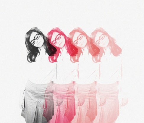
This design photo shows repetition and overlap, which adds an obvious movement to the piece, and sense of activity using time, though this is a still picture.

Image

http://butdoesitfloat.com/62998

There is rotation shown in this image through pathways that lead our eye in an oval-like motion around a globe figure. This sort of rotation is what implies activity and movement so gracefully.

Image

(http://www.flickr.com/photos/dkilim/8365945652/in/faves-garmonique/)

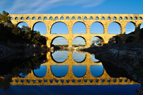
The reflection in this image shows movement by making the eye continue to look in both directions (above and below) the horizon line. The direct reflection keeps us guessing as to what was mimicked, and what was the original.

Image

http://cillustrations.blogspot.com/2013/11/conceptual-illustrations-by-daniel.html

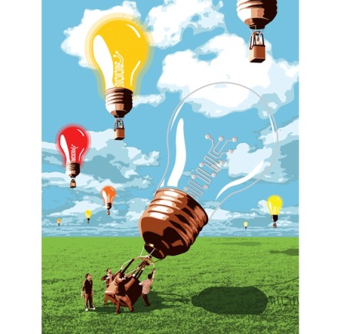
The size of the lightbulbs in this image give depth and perspective, which is another way of showing movement from one object to the next. There is a sense of activity by showing that the closest lightbulb is being pushed up at the moment, and that the past smaller lightbulbs have already gone through that same process before.

Objects

Objects are created by boundaries. A space with limitations is what makes up the creation of an object to the human eye. Whether these boundaries are organic, geometric, or random, they are all legible signs or articles. The size of these objects that are created by boundaries plays a huge role in their function. However, the purpose of the size in relation to its placement can also differ depending on the perspective of the viewer and the context in which they are looking at it. Color, and more specifically hue (the wavelength of a color), tone (lightness/darkness), and saturation (ratio of hue/white content), is also an important aspect to an objects meaning. Similar to the abstract structures discussed earlier in Leborg’s book, texture can come into play with an object in abstract form. Whether it is a formal, informal, gradation, radiation, or spiral texture, this element of an object exists to give depth and dimension to objects. The texture can consist of lines or objects. An object, that’s form depends on its structure lines to define it, is called a concrete structure. Similarly, visible structures are structures with visible structure lines, and they can consist of lines and objects or just lines. Active structures however, occur when the lines influence the form of the objects within the overall structure. To be active, a structure does not have to be visible. (Christian Leborg – Visual Grammar)

In a blog written by Steven Bradley, the function of structures and their forms are further discussed.  Though Leborg tells some of the reasoning behind placement and size, this blog talked about how the whitespace within or around planes and surfaces can be filled in with color and pattern, which can create “surface activity”. I also liked how the author of this blog touched on the “dot” building block of surface and structures, relating this topic back to it’s initial stages of form and line. I found it very interesting how this blog talked about pattern and texture, as well. Bradley explained the differences between pattern and texture as being a difference of structure vs. random placing. Pattern is described as something repetitive and predictable, whereas texture is thought of as something irregular and organic, something that can vary from line to line or shape to shape. Implied texture is the only kind of texture that can be shown on the web, for according to this blog, texture is physical, and something that we can feel whether it be soft, hard, smooth, or tough. The surface activity is an important aspect to a structure and color, texture, pattern and size make up this important element in design.

(http://www.vanseodesign.com/web-design/structures-patterns-textures/)

Image

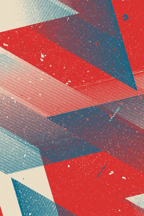
This image represents texture being created by lines and dots, making up different objects, and structures. Some of this repetitive texture could be thought of as pattern according to the blog post I found, and partly a “gradation” texture according to Leborg. (Marius Roosendaal iPhone WP)

Image

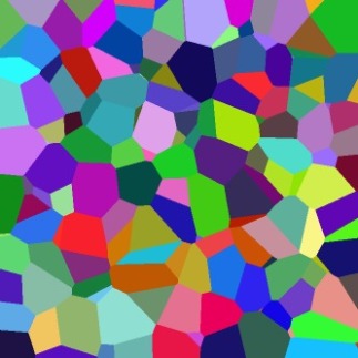
The hues, tints, shades, and different saturations in these colors are filling in objects and making lines to separate individual structures. (Coloured Voronoi 3D slice.png – Wikipedia, the free encyclopedia)

Image

This structure made of depth, line and color, changes meaning based on its placement, and that perspective can then further change based on who is viewing it. (Yesstudio.co.uk imageholderbcloseup.jpg)

Image

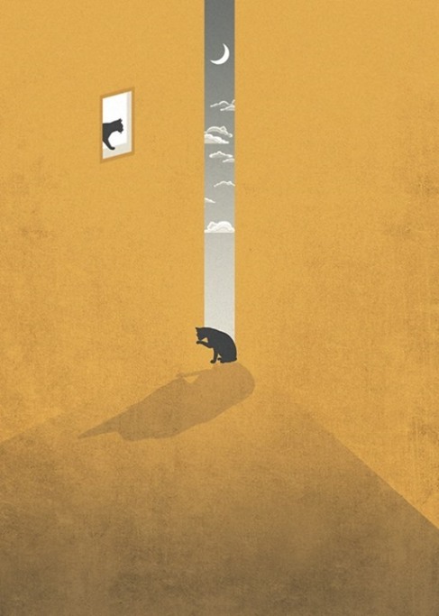
These cats act as objects, which because of their size relative to their environment look small. However, if one was focusing in on a smaller section of this image, the cat’s size may be relatively larger. (Sedki Al Imam de.sign)