Print production and presentation

After reading the unit about print production and presentation in Dabner, Stewart, and Zempol’s Graphic Design School, I was having recollections of the many problems u have had with printing, color matching, cutting, and layout even after thinking the design was “complete”. After reading a little more about exporting and how important preparing files for print is (whether it be a PDF or an entire packaged document with links and fonts), I began to save myself a little more time when it came to figuring out that portion of the project. I also really appreciated how Graphic Design School discussed the craft of a design as another important production step. Often designers tend to think once their design is completed on the computer, and even printed correctly, that the cutting, assembling, folding, etc. is the easy part. Though some people may be more gifted in the presentation process, for some (like myself) shaky hands lead to crooked cuts and bloody fingers, which made reprinting frustrating. I have learned throughout the execution/craft process to be mindful of what the finishing product is meant to look like not only while you are designing, but also while you are putting it together at the end.

I stumbled upon an article written by Marco Kramer called “10 Pre-Press Tips For Perfect Print Publishing,” after reading the chapter on production in Graphic Design School, and came upon many similarities in tips for how to produce your printed designs. When it comes to color, the difference in RGB and CMYK is all I had really paid attention to, thinking, “one is for print, one is for web- how hard can it be?” However, from personal experience, I can say that color is much more complicated and harder to match to what exact shade/tone you were aiming for, than I thought. Though printers may sometimes be the problem, a lot of the color matching starts with the color mode you have set up in your document. In this article, I was made aware that you should always edit your Photoshop pictures in RGB rather than CMYK because RGB is created with light rather than darks, therefore your images appear brighter. To view how these images will look printed (when converted into CMYK mode in Indesign), you can select viewèproof colors, and make sure “working CMYK” is selected, and the proof of print material will show in photoshop.

cmykrgb
RGB colors are known as “additive colors” because when they come together they make white, and are therefore created by light. RGB is what is left when you subtract CMYK, which is why CMYK colors are called “subtractive.” CMYK starts with all the colors, and then when subtracted, black is created.
(Tommy Perez business card design) - these carefully cut cards make for an interesting 3d design, but the thought process behind them is what made the execution able to be so consistent. The placement of color, lines, and type had to be exported correctly and carefully.
(Tommy Perez business card design) – these carefully cut cards make for an interesting 3d design, but the thought process behind them is what made the execution able to be so consistent. The placement of color, lines, and type had to be exported correctly and carefully.
This books cutout methods also had to be carefully looked at, along with the what looks like, metallic overlay for the stars. The  black paper that these colors seem to be printed on also had to be carefully considered so that the kind of paper was taken into account with the inks, coating, etc.
This books cutout methods also had to be carefully looked at, along with the what looks like, metallic overlay for the stars. The black paper that these colors seem to be printed on also had to be carefully considered so that the kind of paper was taken into account with the inks, coating, etc.
(found on designspiration) Another example of intricate cutting shown in this beautiful illustration creation, exemplifies the extreme on color and cutting planning . Though this illustration could have been fully created by hand, it shows us how thought out color and layout need to be in order to produce something that fits and completes the ides you have in your head (or on screen).

Arts and Crafts Movement

For some, the availability to reproducing in large quantities was not as exciting as it was to others. During the arts and crafts movement it became popular again to create things by hand, one at a time so that the book felt more real, more personal. During the industrial revolution, people who felt that artist morality and touch was being diffused, reacted by making book design less of a mass production process, and more like a handcrafted limited edition art piece.
William Morris, who grew up along the English countryside, was the son of a wine importer, who published his first volume of poems by the time he reached 24. During his time at Exeter College, he and a friend by the name of Edward Burne-Jones were intending on joining the ministry. Not long after graduating however, they both realized they wanted to become artists and because of the wealth of Morris’s father he was able to experiment as much as he desired. After Morris got married, he and his wife moved into a house that was built for them, and by helping to design and furnish the interior, Morris became inspired and joined a decorating firm in which anything from glass windows to furniture and fabrics were designed. Inspired by his firm and work, a group called the Century Guild consisting of a few young designers and artists, decided to create a magazine called The Century Guild Hobby Horse which consisted of many art pieces and articles relating to the arts and craft movement, along with the decadent movement and some art nouveau. Its paper was handmade, and included woodblock illustrations, which the served the arts and craft movement advocates well.

This movement not only encouraged the use of using human hands instead of machinery to create art, but it also encouraged beautiful thought out aesthesis in design compositions, rules, and materials so that art was able to become respected through its original form, once again. Though easy reproduction was great for advertising and the ability to share and communicate ideas, the arts and crafts movement emphasized the importance of art within printing. Mackmurndo, the one who started The Century Guild Hobby Horse, introduced how intricate and “art-like” design and typography can be, to William Morris. Morris quickly became passionate about margins, layout, typography, and all the possibilities of book design once Mackmurndo explained the techniques and processes that go into the design world, and how similar the techniques are to his idea of art. Spinning off of this explanation of art, an article called “On the Unity of Art” written in 1887, spoke about how all forms of visual expression should be considered art. Leaving us with the statement; “For when you begin to realize, that all kinds of invented Form, and Tone, and Coulour, are alike true and honorable aspects of Art, you see something very much like a revolution looming ahead of you.”

The Kelmscott press was the last piece that Morris leaves with us to ponder and appreciate as we study not only art, but also society and the artist’s mindset. Consisting of 556 pages of intricate ornamental letters, typefaces that Morris himself designed, and illustrations from Walter Crane along with many others, was the Works of Geoffrey Chaucer. It involved elaborate graphics and drawings made with woodblocks, and typefaces such as Chaucer, which Morris created for this book. The book consisted of writings by Morris himself, along with those of his favorite medieval authors. This work left us with so much handcrafted beautiful parts, that you could almost feel the sweat and tears put into it when you look at the individual pages themselves, and I believe that was probably his intention.

Meggs, Philip B. “The Prolouge to Graphic Design.” A History of Graphic Design. New York: John Wiley & Sons, 1998. 4+. Print.


The designers toolbox

The “tools” that graphic designers use can range in anything from exacto knives, to cameras, to paper. However, with the rapid development of technology the programs and applications used to create, complete and finesse design ideas are extremely helpful when used correctly. Photography and the use of a camera, is a very powerful tool in design, and can make or break the composition depending how you use the photo. Programs (such as Photoshop) come into handy when wanting to fix a mediocre picture you may have took, into consisting of more or less contrast, hierarchy, placement, cropping, fixing, etc. You can also use Photoshop to combine or manipulate images so that a new mood or composition is created all together. Though it is possible to add text in this program, InDesign is the most reliable and easy when it comes to layout and text formatting. Layout, publication, and package designs are most often made using InDesign, for its ability to create grids, and arrange text is most effective. When a designer wants to create vector images (those that wont be destroyed in pixels after enlargement), or simply make more clean and concise designs such as logos or complex illustrations, Illustrator is the go-to program. Its ability to help designers and artists bring their ideas to life on the computer is remarkable.

The discussion about what these design tools can do, led me to think about how technology has affected designs over the past 10 years of development, and how technology will continue to change future designs. Before these innovative programs were created, there was more limitation, and the ability to quickly create texture, overlay and combine elements, structure layouts, and create consistent style was extremely difficult to say the least. Once these programs were developed, designer’s creativity heights not only took off, but the expectations of the consumers were greater as well. In a blog on Bright Hub, written by Amber Neely, she states “Product packaging was simple but effective, but didn’t wow us. Today, when we look at a great website, we expect every element within it to fit into the overall design, to flow easily from one area to the other. Product packaging has become an art in itself, with dazzling arrays of colors and information that adds to the design, rather than detracts from it.” Not only do designers have more options and availability to create their ideas with these tools, but the pressure to become better and unlike anything that had been created in the past is much greater.

(Graphic Design School. By: Dabner, Stweart, and Zempol)
http://www.brighthub.com/multimedia/publishing/articles/121403.aspx#


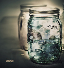
Photoshop can be used to integrate two separate photos, or illustrations in order to create distortions of reality. The ability to change the color, light, and shadows in these new images also allows the overall mood to be either enhanced, or changed all together.  (new media design – designspiration.net)
Photoshop can be used to integrate two separate photos, or illustrations in order to create distortions of reality. The ability to change the color, light, and shadows in these new images also allows the overall mood to be either enhanced, or changed all together. (new media design – designspiration.net)
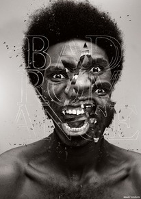
Photoshop not only allows you to change the color of your pictures and fix the lighting on ones that didn't turn out as well as you hoped, but it allows for distortion, manipulation, and even the addition of text and different elements as well. Because of programs like photoshop, designers and artists have the ability to play with images like never before. (Bad_Romance_by_revuh.png)
Photoshop not only allows you to change the color of your pictures and fix the lighting on ones that didn’t turn out as well as you hoped, but it allows for distortion, manipulation, and even the addition of text and different elements as well. Because of programs like photoshop, designers and artists have the ability to play with images like never before. (Bad_Romance_by_revuh.png)
Indesign is a program that people who love type, are addicted to. It's ability to easily align bodies of text and images into a structured system, makes layouts like this flow and easy on the eyes. (Craft Victoria Annual Report 2012)
Indesign is a program that people who love type, are addicted to. It’s ability to easily align bodies of text and images into a structured system, makes layouts like this flow and easy on the eyes. (Craft Victoria Annual Report 2012)
Illustrations are beautiful when done by hand, but when it comes to laying color where you want it, fixing mistakes, and creating crisp, flowing compositions, Adobe's Illustrator program is extremely powerful. As shown in this recreation of Alice and Wonderland, though there is so much going on in the composition and colors, the neat line strokes and flow of the images make the characters look crisp and finished. (Reinvented Disney Posters by Mondo)
Illustrations are beautiful when done by hand, but when it comes to laying color where you want it, fixing mistakes, and creating crisp, flowing compositions, Adobe’s Illustrator program is extremely powerful. As shown in this recreation of Alice and Wonderland, though there is so much going on in the composition and colors, the neat line strokes and flow of the images make the characters look crisp and finished. (Reinvented Disney Posters by Mondo)

Relation

Relations –

The way objects are positioned next to other objects, margins, and the page they reside in, affects the energy applied to them and the impacts that outside forces have. The difference between static and attraction can easily demonstrate the difference between activity, and a still shape. Though a static object can be influenced by the space around it and the page’s borders, it does not have near as much activity or movement as objects grouped together do. Symmetry and Asymmetry is an arrangement that represents either the balance (identically across an axis) or imbalance and disproportion of objects. When I say “balance,” I am talking about when all components (of either an object or a composition) have visual equilibrium.  When objects are repeated, groups come into play, and these groups then can compose a variety of different balance models. The difference between the structure lines between the objects in these groups, then defines whether an assembly is coarse or fine (fine structures being closer in distance between them). If items are fine in some parts of the composition, and coarse in other places, (if they are sporadically placed), this is called diffusion. Structures can also define directions based on their placement, and therefore also simple positioning. The way objects are placed controls the space within a page (white space vs. fill), and weight within the form of the page. A composition’s dominance can also be affected by the amount of objects controlling an area. When objects do not stand out against one another, a neutral composition is formed. However, when objects are positioned by overlapping or by size, a foreground/background can be determined between the objects. (Christian Leborg – Visual Grammar)

On a site I found based on the principles of design, I found it very interesting the way visual weight was explained. In Leborg’s book, visual weight was briefly discussed in comparison to white space. However, in this explanation I found that by showing that visual weight is influenced by orientation, quantity, isolation and position, I was able to make a better connection between visual weight and its part in object placement/relations between objects. Orientation was described by clarifying that diagonal orientation shows more visual weight than horizontal or vertical placement. Overall, these elements were described in relation to symmetry and asymmetry as well, which was not as clearly connected in Leborg’s writings. Asymmetry and symmetry was explained in terms of balance, but on this website there is a clear connection between visual weight and balance shown. Instead of visual weight being a element in deign, it is shown here as the foundation for all balance, symmetry, and contrast within a composition. The first sentence on this blog I found really straightens out any question about the connection of these elements; “Balance is the equal distribution of visual weight in a design.” (http://nwrain.net/~tersiisky/design/balance.html)

symmetry

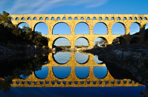
Symmetry is an important part of balance within design. Perfect symmetry, as demonstrated here, is created by objects repeated or reflected across an axis. This kind of symmetry is formal, and therefore stable and orderly. (behance.net)

asymmetry

Asymmetry may play with white space, and give a more uneven, unstructured composition. This however, can sometimes give a more interesting composition that, though  not as balanced, may be more interesting in overall visual weight. http://mwmgraphics.blogspot.com/

This image shows a strong visual weight in one part of the image, and a definite sense of balance and symmetry as well. The objects are placed in a way that give dominance over one part of the composition, while leaving some white space in the top.  (Pamela Cocconi from flickr.com)

This image shows a strong visual weight in one part of the image, and a definite sense of balance and symmetry as well. The objects are placed in a way that give dominance over one part of the composition, while leaving some white space in the top. (Pamela Cocconi from flickr.com)

Diffusion (the combination of fine and coarse placement within an image) can give variety within a structure, and can either look scattered or give an uneven pattern  affect. (Hannes Beer from flickr.com)

Diffusion (the combination of fine and coarse placement within an image) can give variety within a structure, and can either look scattered or give an uneven pattern affect. (Hannes Beer from flickr.com)


Activity

Activities – The illusion of movement is seen as activity in design. Therefore, activities are actually static. Repetition and frequency or rhythm can play into activity through alignment and positioning. Repetition can be any sort of shared prominent characteristic throughout many repeated objects, and rhythm just refers to the repeating distance between those objects allowing a sense of frequency to be acquired throughout the pieces. Mirroring can be a direct reflection across an axis, or it can consist of a reflection against a volume.  The volume mirroring transpires when an original object is reflected into a different item, distorting the view of the original, making the light reform its shape. Rotating objects along a bath, whether it is circular or elliptical, is another way to show easily show activity and movement. Upscaling and downscaling/changing the size of an object by increasing it either vertically or horizontally can add movement to objects as well. Repetition and frequency, when used along a path, can create this sense of movement. I say “sense,” because in reality, movement is only possible as a force that is not still on a page. Visual movement however, can still be created as an illusion, when a path gives a directional lead to repeated, rotated, enlarged, and/or scattered objects. (Christian Leborg – Visual Grammar)

On “Write Design Online,” rhythm is described by repetition and arrangement. I felt as if this depiction of movement on this website was much more informative about rhythm in particular, which in my opinion, is the key attribute to activity in design. This website discussed the different types of rhythm by explaining the difference between regular rhythm, flowing rhythm and progressive rhythm. Regular rhythm consists of the space between elements being relatively the same in size and shape, and flowing rhythm is more organic. Flowing rhythm seemed to show movement and activity more through line than separated objects. Progressive rhythm shows an arrangement of objects within a series of phases. Size, overlapping, direction, and other elements of design discussed on this site also appealed to me when it comes to discussing how the relationship between forms can create “static” movement. Though movement is a human form that cannot really appear on paper, there are many ways that we can depict movement even in a still and flat manner, and all of it depends on the placement and this relationship between objects. Direction was talked about on this site as something “only possible when shapes or forms show a definite sense of direction without the slightest ambiguity.” (http://www.writedesignonline.com/resources/design/rules/rhythm-pattern.html )

Image

http://www.mymodernmet.com/profiles/blogs/beautifully-offbeat

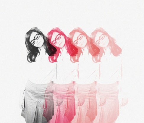
This design photo shows repetition and overlap, which adds an obvious movement to the piece, and sense of activity using time, though this is a still picture.

Image

http://butdoesitfloat.com/62998

There is rotation shown in this image through pathways that lead our eye in an oval-like motion around a globe figure. This sort of rotation is what implies activity and movement so gracefully.

Image

(http://www.flickr.com/photos/dkilim/8365945652/in/faves-garmonique/)

The reflection in this image shows movement by making the eye continue to look in both directions (above and below) the horizon line. The direct reflection keeps us guessing as to what was mimicked, and what was the original.

Image

http://cillustrations.blogspot.com/2013/11/conceptual-illustrations-by-daniel.html

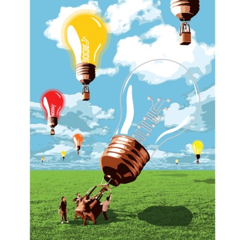
The size of the lightbulbs in this image give depth and perspective, which is another way of showing movement from one object to the next. There is a sense of activity by showing that the closest lightbulb is being pushed up at the moment, and that the past smaller lightbulbs have already gone through that same process before.

Objects

Objects are created by boundaries. A space with limitations is what makes up the creation of an object to the human eye. Whether these boundaries are organic, geometric, or random, they are all legible signs or articles. The size of these objects that are created by boundaries plays a huge role in their function. However, the purpose of the size in relation to its placement can also differ depending on the perspective of the viewer and the context in which they are looking at it. Color, and more specifically hue (the wavelength of a color), tone (lightness/darkness), and saturation (ratio of hue/white content), is also an important aspect to an objects meaning. Similar to the abstract structures discussed earlier in Leborg’s book, texture can come into play with an object in abstract form. Whether it is a formal, informal, gradation, radiation, or spiral texture, this element of an object exists to give depth and dimension to objects. The texture can consist of lines or objects. An object, that’s form depends on its structure lines to define it, is called a concrete structure. Similarly, visible structures are structures with visible structure lines, and they can consist of lines and objects or just lines. Active structures however, occur when the lines influence the form of the objects within the overall structure. To be active, a structure does not have to be visible. (Christian Leborg – Visual Grammar)

In a blog written by Steven Bradley, the function of structures and their forms are further discussed.  Though Leborg tells some of the reasoning behind placement and size, this blog talked about how the whitespace within or around planes and surfaces can be filled in with color and pattern, which can create “surface activity”. I also liked how the author of this blog touched on the “dot” building block of surface and structures, relating this topic back to it’s initial stages of form and line. I found it very interesting how this blog talked about pattern and texture, as well. Bradley explained the differences between pattern and texture as being a difference of structure vs. random placing. Pattern is described as something repetitive and predictable, whereas texture is thought of as something irregular and organic, something that can vary from line to line or shape to shape. Implied texture is the only kind of texture that can be shown on the web, for according to this blog, texture is physical, and something that we can feel whether it be soft, hard, smooth, or tough. The surface activity is an important aspect to a structure and color, texture, pattern and size make up this important element in design.

(http://www.vanseodesign.com/web-design/structures-patterns-textures/)

Image

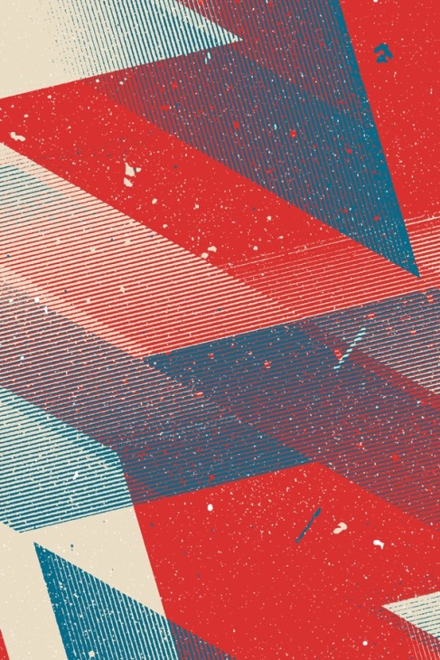
This image represents texture being created by lines and dots, making up different objects, and structures. Some of this repetitive texture could be thought of as pattern according to the blog post I found, and partly a “gradation” texture according to Leborg. (Marius Roosendaal iPhone WP)

Image

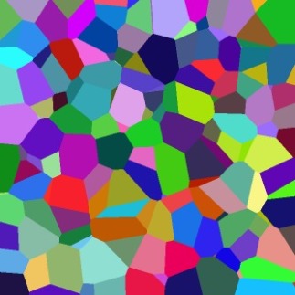
The hues, tints, shades, and different saturations in these colors are filling in objects and making lines to separate individual structures. (Coloured Voronoi 3D slice.png – Wikipedia, the free encyclopedia)

Image

This structure made of depth, line and color, changes meaning based on its placement, and that perspective can then further change based on who is viewing it. (Yesstudio.co.uk imageholderbcloseup.jpg)

Image

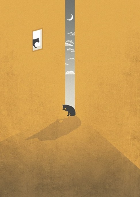
These cats act as objects, which because of their size relative to their environment look small. However, if one was focusing in on a smaller section of this image, the cat’s size may be relatively larger. (Sedki Al Imam de.sign)

Structures


Structures are made up of a combination of objects, but whether a structure is abstract or not depends on if those objects can be aligned in a grid. If the items are not visually aligned, they are abstract. But if they do align, it is considered a formal structure. Therefore, an informal structure entails not following a grid or any regularity. If there are no straight structure lines followed, then the configuration is considered informal. A gradated structure is a repeated structure, which changes in size and/or form gradually. This graduation can happen in many different ways, but two of the most common are the parallel and radiating gradations. Radiation can also be another kind of structure, however. A radiating arrangement is both formal and repetitive, and has objects that diverge from a shared middle. If an alignment can be estimated as a structure just by looking at it, it is considered a visual distribution. Invisible or Inactive structures can show the placement of the pieces in the structure, but do not affect the arrangement. The structural skeleton of an object is the space between each part of a structure, and the proportions and routes among them. (Christian Leborg – Visual Grammar)

Though Christian Leborg explains the basic vocabulary relating to the different types of form within structures, in his book “Visual Grammar,” it was interesting to read about the reasoning behind these forms in “Principles of Form and Design” by Wucius Won. Won explains the forms very similarly to the way Leborg does, but he expands with some more examples and reasoning. Won talks about the organization and relationship between objects being the foundation for different structures. Informal as oppose to formal structure is explained as being free as oppose to grid-like, but a “semi-formal” structure is also discussed. This refers to an in-between sort of composition with having either a grid or no grid, but showing some structure over none, yet not completely controlled. The comparisons that Won gives are also very informative. Visible structure explained as actual visible lines between the parts of the overall composition, made it easier to comprehend “invisible structure”, where the lines are there in our mind, just not shown on the page. The difference between conceptual lines and actual lines, also helped explain the difference between active and inactive structure. Inactive structure being where there are only conceptual lines, and active structure consisting of structural subdivision by using conceptual lines.

Image

Here is an example of an abstract structure which consists of no grid or visible structure lines, but it still shows objects making a structure when placed together. (Manjuzaka – Etsy)

Image

This structure adheres to a grid, and clearly has axes to which the objects within the composition all correspond to. There is equal distribution throughout. (http://www.dataisnature.com/)

Image

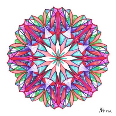
Here, radiation is shown. There is a clear center in which different parts of the structure come from. It adheres to a grid, and formally spreads out from a center point. ( http://mandalland.blogspot.com/ )

Image

The form of the objects in this structure gradually change in both size and form, clearly designating this structure as a type of gradation. (http://fiore-rosso.tumblr.com/post/27829086943/hengki-koentjoro-gradation)

Abstract Objects

Abstract objects are shapes that can not be tangibly formed, like the fact that the period that you put at the end of a sentence is actually a representation of the point it is suppose to be. A point then, is actually just the absence of marking, and it is made by the space between other marks, or it may be made where two lines meet. A line is made up of multiple points, bordering one another, and the “shortest distance between two points is a straight line” (Leborg 11).  Beyond a line, is a surface, which consists of a row of lines. A surface is two-dimensional because it is a point that multiplied in two different directions. Furthermore, volume is made up of multiple surfaces (which of course, are created by lines and points.).  Dimensions, are perceived as the height, width, and depth that we see. Anything less or more than three dimensions, we are only able to imagine, not actually perceive. Anything dimension besides 3D is an abstract to the human eye. Format, is the alignment of anything we see, in relation to its limits. Format consists of scale and proportion.

To complement several of the concepts I read by Leborg, I found a few online sources, which discussed some of the same ideas. In a blog by Steven Bradley (http://www.vanseodesign.com/web-design/points-dots-lines/) about points, dots, and lines, the idea that positive and negative space create these primary elements of design, is prefaced. Bradley implies that all dots and points have a function or purpose to them, and that the alignment of several dots next to each other (or even just two), can change their characteristics. Since visual hierarchy, a focal point, and therefore dominance, are such sought after design principles in any composition, Bradley explains how dots, points, and lines allow these essentials to appear. To build an attractive design, surfaces and dimensions usually make up the end result/visual format. However, to create two and three-dimensional compositions, we must start with the alignment of points, which can be more complicated when broken down, than we may realize. The idea that contrast, balance, and movement are all created based off of lines and dots also shows us that these principles are essential to understand, in order to create strong design compositions.

44-constellations
A single point can serve as the central focus in an image, or several points grouped together can express different ideas or lead the viewer’s attention in a certain directions. Here we see several points used to display a constellation. (http://www.projectimpact.org/assembliesdescriptions.php?p=no&id=44 )
Lines can serve many purposes, such as stopping eye movement, arranging or separating, directing attention to specific areas, among other things. (http://flic.kr/p/9aEiMQ)
Surfaces can be created by a combination of lines, making a two-dimensional object. A multitude of lines is used to make a template, or surface, which can then be used as a bridge for volume and dimension, therefore creating 3D images. (http://25.media.tumblr.com/d997dab7265616db34abefd694148d19/tumblr_mudicwKfZN1s82xkfo1_400.jpg)
Dimension is an abstract concept, since the human eye is only really able to see in 3D (nothing more, nothing less). However, there are many dimensions possible, made by different alignments of surfaces. Here we see a great example of depth perception, created by dimensions. (http://media-cache-ak0.pinimg.com/originals/b8/76/48/b8764896baed18f60a0bcae29dbf3b79.jpg )
Dimension is an abstract concept, since the human eye is only really able to see in 3D (nothing more, nothing less). However, there are many dimensions possible, made by different alignments of surfaces. Here we see a great example of depth perception, created by dimensions. (Uploaded to Pinterest by Jose J. Cabrera. http://media-cache-ak0.pinimg.com/originals/b8/76/48/b8764896baed18f60a0bcae29dbf3b79.jpg )